

Some traders see a head and shoulders pattern in S&P 500, some other traders see a reverse head and shoulders and even some others see a complex top formation. They all have something in common: they are fooled by randomness.
I expect newbies to shortly embrace these random chart formations until they finally understand they are random, but I’m puzzled when I hear people who are supposed to have been in the markets for many years to make references to them. But that is their choice and they are free to see even unicorns in charts.
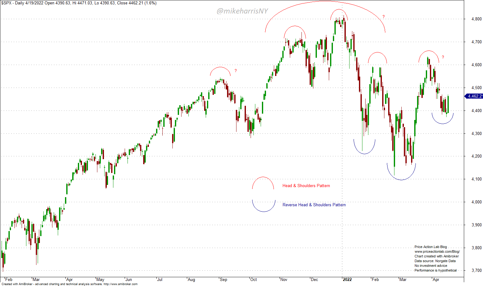
There are countless posts on financial social media and blogs about a “reverse heads and shoulders” pattern in S&P 500 chart. I have indicated this pattern in the above chart using blue semicircles for the head and the shoulders.
Usually, those who see a reverse head and shoulders are the bulls because it is supposed to be a continuation pattern, at least according to the “experts” or “authorities” on technical analysis. Eventually, the market will go up, or down, there are only two possibilities, even after a long consolidation.
There are some other similar formations on the chart that may indicate the different directions of prices. Those are indicated with the red semicircles. To start with, there is a normal head and shoulders with the head formed near the close of last year and the beginning of this year. There is also a complex head and shoulders formation indicated with semicircles with a “?” next to them. Well, some technical analysis “purists” may claim the right shoulder is slightly above the left. Other, not-so-purists, may see that as unimportant because they are bears and the pattern offers confirmation.
In all the above cases what you see is the result of Brownian Motion and random drift. After September of last year, the uptrend is no longer smooth and volatility has increased significantly. Specifically, the 21-day annualized volatility of daily returns rose from about 7.4% on September 3, 2020, to about 25.5% by March 18, 2022. This was a rise by a factor of more than three in six months. Due to high volatility, it is natural that random patterns are formed and some people are getting fooled by them. Worse, some people choose the ones that confirm their bias about market direction.
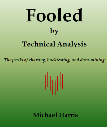
As I have mentioned in my book Fooled by Technical Analysis: The perils of charting, backtesting, and data-mining, all sorts of patterns form in random data. Below is an example from the book.
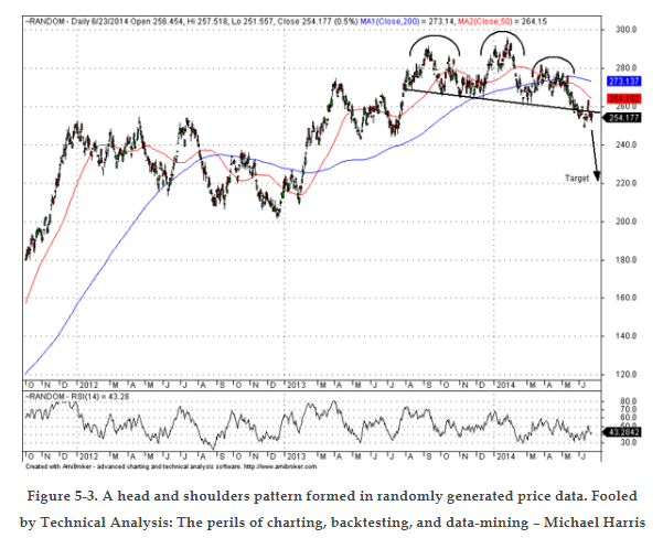
The chart shows a head and shoulders pattern formed in random data. Even if these patterns are predictive at times, there is no way of knowing when. In addition, no one knows the long-term mathematical expectation derived from using these patterns due to the subjectivity in identifying them. In my opinion, the mathematical expectation is zero in the best case, and in the worst case, it’s highly negative. But above all, those using these patterns are fooled by randomness.
Premium Content 10% off for blog readers and Twitter followers with coupon NOW10
Disclaimer: No part of the analysis in this blog constitutes a trade recommendation. The past performance of any trading system or methodology is not necessarily indicative of future results. Read the full disclaimer here.