


We tested the performance of the Benner Cycle and also examined its philosophical underpinnings. Is the cycle the “sure thing”, as its inventor claimed, or an illusion? How is the profitability of market analysis tools changing over time?
The Benner Cycle chart is posted frequently on social media. Samuel Benner came up with the chart in 1875 on a business card. It was an attempt to predict future cycles in the stock market.
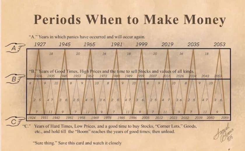
The chart depicts the years of hard times (C), the years of good times (B), and the years of panic (A) in the stock markets. Benner suggested buying during C and selling during B.
Access the full report with a Premium Articles or All-in-One subscription. By subscribing, you have immediate access to hundreds of articles. Premium Articles subscribers have immediate access to more than two hundred articles, and All in One subscribers have access to all premium content except daily mean-reversion signals.
|
This post is for paid subscribers
Already a subscriber? Sign in |
Specific disclaimer: This report includes charts that may reference price levels determined by technical and/or quantitative analysis. No charts will be updated if market conditions change the price levels and/or any analysis based on them. All charts in this report are for informational purposes only. See the disclaimer for more information.
Disclaimer: No part of the analysis in this blog constitutes a trade recommendation. The past performance of any trading system or methodology is not necessarily indicative of future results. Read the full disclaimer here.
Charting and backtesting program: Amibroker. Data provider: Norgate Data
If you found this article interesting, you may follow this blog via RSS, Email, or Twitter.