Recently I read an analysis about the possibility of Dow dropping to 4,000 or even as low as 1,000. The claim was that technical analysis of long-term charts supports such a possibility. I argue here that it is not pure technical analysis that points to such possibility but a subjective interpretation of charts driven by a belief that the current debt crisis will eventually lead to a collapse of the equity markets.
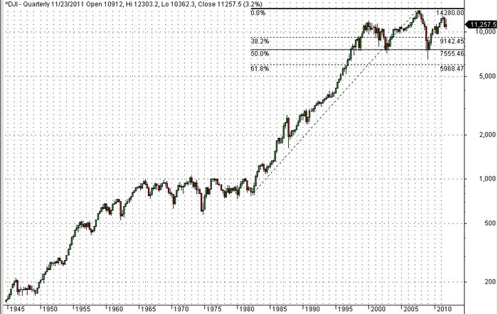
Most of those who believe in a coming collapse of DJIA to 4,000 or even lower point to the long-term quarterly chart of the index (log scale) shown above and to a head and shoulders formation with the left shoulder formed during the first quarter of year 2000, a head formed at the all-time high during the fourth quarter of 1997 and the right shoulder formed during the second quarter of last year.
To start with, this is not a typical bearish head and shoulders formation. The right shoulder is about 1,000 points higher than the left shoulder. In a typical bearish formation the high of right shoulder is often lower than the high of the left shoulder. However, since technical analysis is not a rigorous science I will not insist on this point, which in my opinion is an important one and alone invalidates any attempt to justify a potential collapse of the index based on this particular H&S formation.
Fact 1: Patterns on long-term charts may indicate reversal or continuation
I wonder why some analysts see a H&S formation but they do not see a potential inverse H&S formation when looking at the same chart above. The inverse formation has a left shoulder during the fourth quarter of 2002, a head formed during the first quarter of 2009 and a right shoulder under formation. That could serve as a trend continuation pattern. Actually, most chart patterns are either reversal or continuation patterns by virtue of the fact that they have a failure rate (and often by virtue of the fact that for every buyer there is a seller). The particular H&S formation on the log-scale Dow chart can turn into a continuation pattern. When one deals with long-term charts with just one or two observations of a particular pattern, it is very hard to know its success and failure rates. Basically, anything can happen. Any justification of a potential move in either direction is more of wishful thinking that anything else.
Fact 2: Log charts distort chart patterns
What does a log scale actually affect a long-term Dow chart? It actually compresses recent information so that one sees the trend in equal percentage change rather than the arithmetic increase of the index. Log charts are very useful in finance, especially in the longer-term analysis of returns and risks of financial assets but when it comes to chart patterns my opinion is that they are not appropriate because the compressions that takes place distort reality. Below is the same Dow chart with arithmetic scale:
From the chart with arithmetic scale we can see that the 2002 and 2009 lows found support at the 50% Fibonacci retracement level of the uptrend that started in 1982 and ended in 2007. Actually, the 50% Fib retracement level of the 1982-2007 uptrend coincides with the 38.2% Fib retracement level of the 1982 – 2000 uptrend. Certainly, when it comes to severe trend corrections, Fibonnaci numbers rules due to the mass behavior effects, which they model best.
Furthermore, we can see that what appears as a H&S formation on the log chart vanishes from the arithmetic chart unless a very loose definition of the pattern is adopted. One could possibly argue that on this chart we have a double bottom formed at the 2002 and 2007 lows with a potential inverse H&S forming. Thus, the choice of scale may greatly impact what one sees on a chart in terms of pattern formations.
Fact 3: It makes little or no sense to look at very long-term index charts
This is true because they are rebalanced so that the bias is always up by replacing losers with winners. Thus, by virtue of construction, these charts do not represent how the price of some financial asset changed over time but instead how a rebalanced index performed over time, something like an actively managed fund. It thus may make no sense to attribute any significance to patterns formed on the long-term chart of an actively managed index via re-balancing since the composition changes, along with the market participants and the methods they use to trade it in such a long time period.
Conclusion
The Dow may or may not fall to 4,000 or even below that, or it may instead rise sharply to 14,000 if there is a quick resolution the the EU debt crisis but, in either case, long-term charts, especially with a log scale, and any patterns formed on them are mere artifacts of a display method and carry little predictive power about the future. Analysis based on them often reflects personal beliefs mixed with subjective interpretation of economic conditions.
Disclosure: no relevant positions.
Disclaimer:The author is not a financial advisor and does not recommend the purchase of any security or advise on the suitability of any trade or investment in any timeframe. ETF, stock, futures, forex and options trading and investing involves substantial financial risks and can result in total loss of capital. If investment or other professional advice is required, a licensed professional should be consulted.


