

Trading strategy developers are not the only victims of data-mining bias. Stock chartists were the first victims long before backtesting became popular. A recent example is included.
Data-mining bias is the result of the dangerous practice of using data multiple times to test many different unrelated hypotheses until a result is obtained that appears significant. This process is also called p-hacking via multiple comparisons and has been discussed several times in this blog and in my book Fooled by Technical Analysis.
Quants were not the first to be affected by data-mining bias; chartists were long before them but this is rarely discussed.
Looking at many charts and indicators in an effort to find an index, stock or ETF with some interesting pattern ignores all the other charts that did not appear interesting and this is the definition of data-mining bias.
Note that if a result is affected by data-mining bias that does not mean it is necessarily false but that its statistical significance is probably very low. In most cases “false” and “low statistical significance’ are equivalent for all practical purposes over a sufficient average.
Therefore, the chartists – and there are still many of those – who flip through many charts and indicators in an effort to find a good stock to buy or short for next day or week, or forecast the market direction, often fall victims of data-mining bias.
The interesting fact is that at the limit of large samples, this practice has 50% hit rate but most chartists remember only the times they were right the same way that quants focus only on the strategies that were profitable and ignore the many more that have failed.
Consistency is the key here: if an analyst is looking at the same universe of stocks with the same indicators, then data-mining bias is lower. This is why analysts in Investment Banks focus on some specific stocks only. But if one is looking at a moving average cross in NASDAQ stocks and stochastics in Russell 2000 stocks then data-mining bias increases significantly.
Then, there are those websites that publish all those fancy charts with different indicators each time that are supposed to be at extreme levels. This practice boosts data-mining bias because of selection bias.
An example is a chart that is making rounds on social media in the last two days about a rise in the 20-day moving average of NASDAQ-100 for 89 days in a row. The claim is that this has occurred before major corrections.
I have seen many charts like this in the last 10 years with different indicators at extreme levels but the same claim: it is a market top indicator. Of course, this is a lot better than drawing a wedge on a chart and claiming this is the top as someone did in early 2017. But this is a different story with some not so clear dimensions to be discussed another time.
Below is the NASDAQ-100 chart with the count of consecutive up days in 20-day simple moving average.
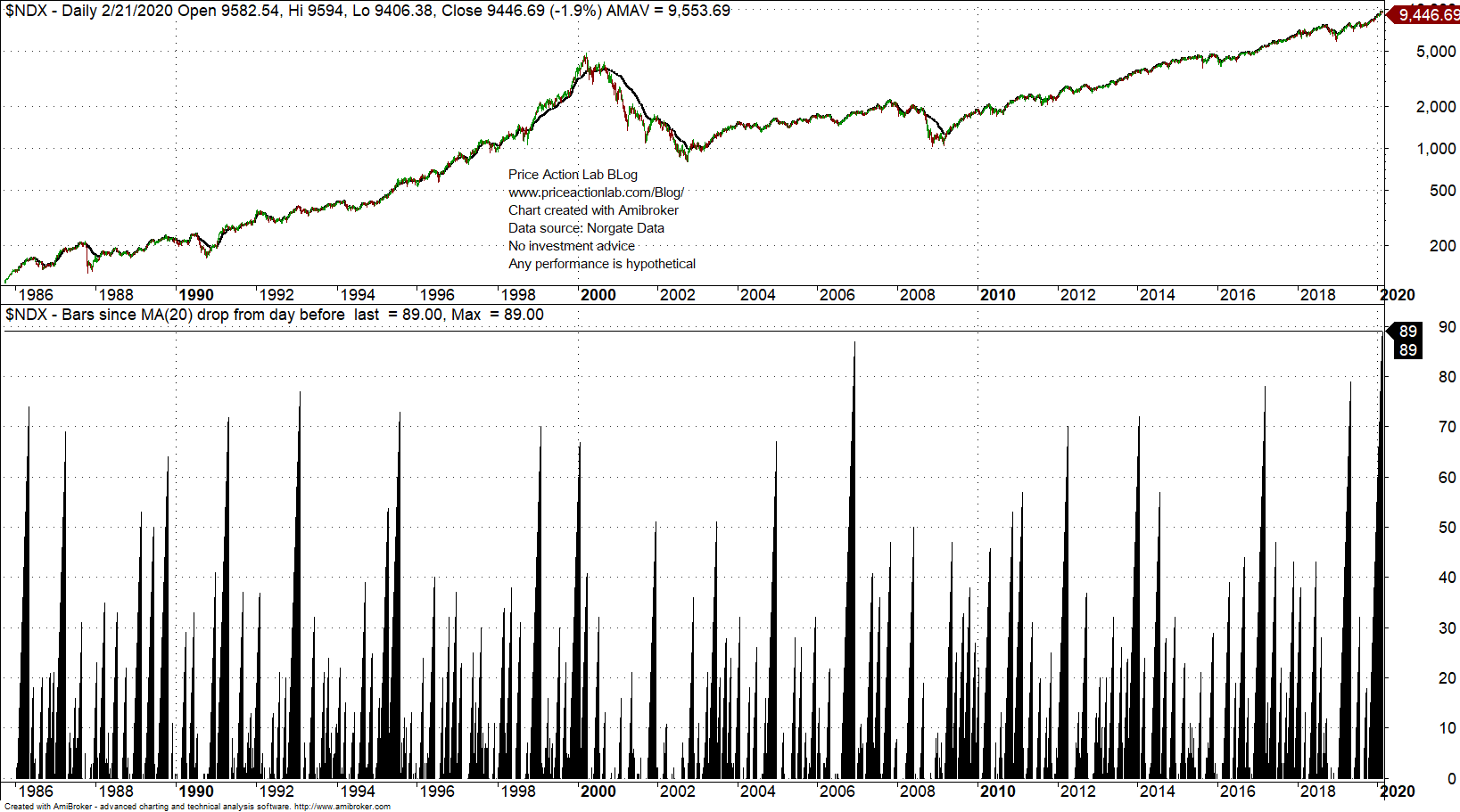
As you can see, the last count is 89 days, meaning that the average has risen 89 days in a row. That is a new all-time high in the indicator.
One method I propose in my book Fooled by Technical Analysis for gauging significance is a test on comparable securities. Below is the same count in NASDAQ composite index.
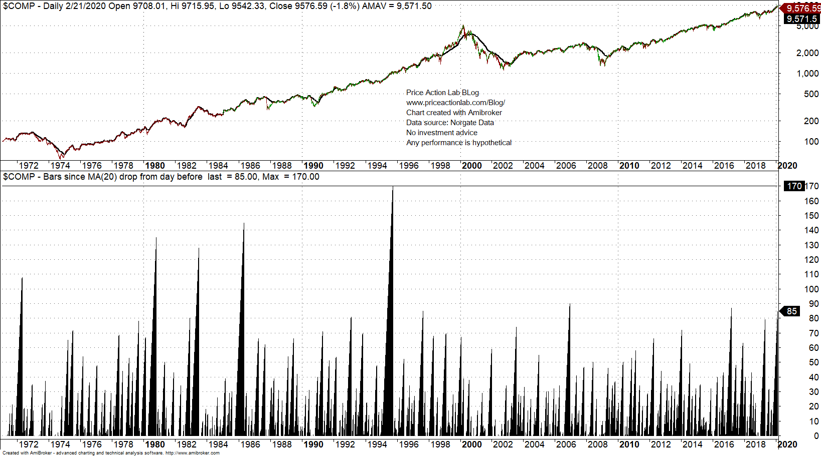
The 20-day moving average rose 175 days in a row in 1995, before the most powerful uptrend in the recent history of the markets.
You do not like tests on comparable securities? What about if we change the period of the moving average from 20 to 25?
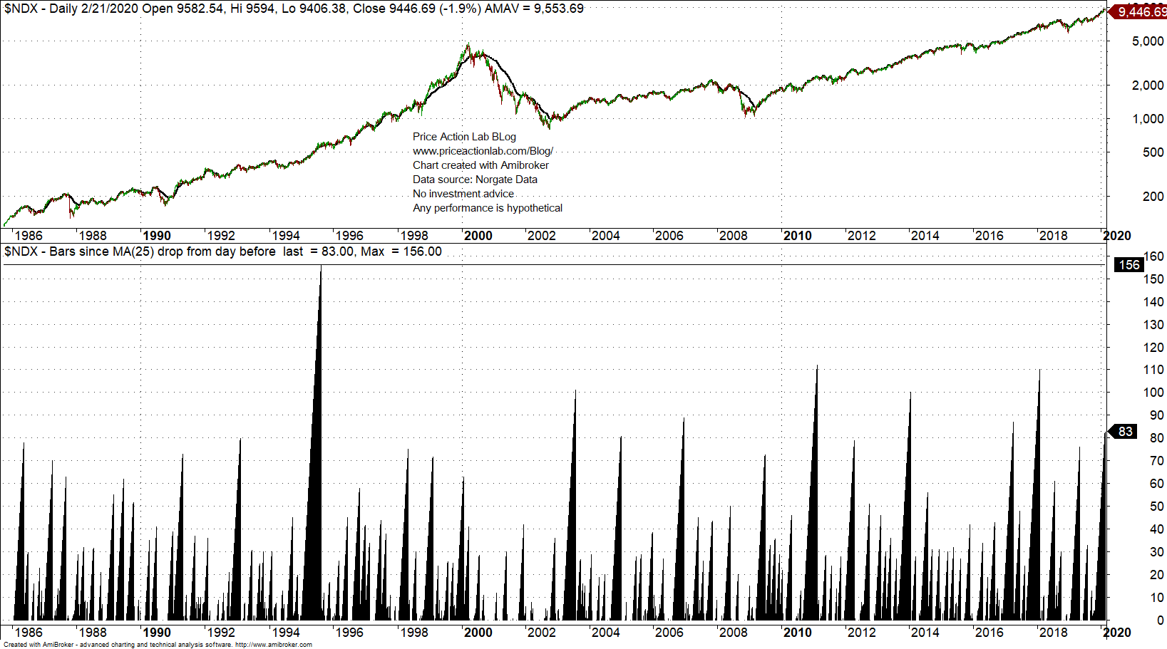
Now the indicator becomes insignificant: only 83 days up versus 110 in early 2018 and 156 in 1995.
The conclusion is that the choice of the period for the moving average ignored many other choices not far away that generated insignificant results; in other words, any conclusions made are plagued by data-mining bias.
The market may go down, especially given the high uncertainty at this point. This is in fact another factor that decreases the significance of the claim using the 20-day moving average because in the absence of this uncertainty probably the claim would not have been made, hinting at confirmation bias.
Looking at charts and indicators is not as an innocent process as it may seem and often as bad as fitting mathematical formulas on historical price data.
You can find another example of chart data-mining bias in this article. This one also made it on financial TV.
Charting and backtesting program: Amibroker
Data provider: Norgate Data
Technical and quantitative analysis of major stock indexes and 34 popular ETFs are included in our Weekly Premium Reports. Market signals for position traders are offered by our premium Market Signals service
If you found this article interesting, you may follow this blog via RSS or Email, or in Twitter